
Every fabric asks two questions: how much does it move, and how much does it swallow. Answer those and the stitch types, underlay and density follow.

The same logo on a polo, a cap and a towel is three different files. Most people accept that in principle and then send one file to all three anyway.
What changes isn't really the stitch types themselves, since satin, fill and run do the same jobs everywhere. What changes is how much support they need underneath, how tightly they sit, and how much detail can survive. Here's how to think about it without memorising a chart.
How much does this fabric move? A knit polo stretches in both directions. A woven canvas barely moves at all. Anything that moves will be pulled inward by the stitches as they form, so the design needs compensation built in, or you get bare cloth showing where two colors should meet.
How much does this fabric swallow? A towel has a pile that stitches sink into. A fine cotton doesn't. Anything with a nap needs a foundation underneath the visible stitching, or the design disappears into the surface.
Almost every fabric-specific rule you'll read is one of those two answers in disguise. Once you know how much a cloth moves and how much it swallows, the build follows.
Underlay is the fourth one nobody sees. It's stitching laid down first to stabilize the fabric and lift the visible work off the surface, and it's the single biggest lever you have when the fabric fights you.
Polo knit and t-shirts. Stretchy, so movement is the problem rather than absorption. Use a cut-away stabilizer, add pull compensation, and don't run density too high or the garment draws in and puckers. This is the most common fabric and the one where a slightly wrong file still looks passable, which is why bad habits survive here.
Caps. Curved, stiff at the front, and stitched outward from the center. Sequence matters more than anywhere else, because a design that works from one side to the other will drag itself off-center. Keep detail bold, and treat a cap version as a new file rather than a resize.
Toweling and fleece. High pile, so absorption is the whole problem. You need substantial underlay to give the stitches something to sit on, and often a water-soluble topping over the surface so the design doesn't sink as it stitches. Small detail is the first casualty. Simplify before you start rather than after.
Twill, for patches. The one fabric you choose rather than inherit, which is why patches are their own job. Stable, cuts cleanly, and covered properly in digitizing embroidered patches.
Denim and canvas. Barely moves and swallows almost nothing, which makes it forgiving. You can carry finer detail here than on almost anything else. Use a sharper needle and watch that dense designs don't go stiff, since the fabric is already firm.
Native wear, agbada and kaftan fabrics. The most demanding work there is, because the cloth often moves and the motifs are large and intricate at the same time. Hooping properly matters as much as the digitizing, and large panels need their sequence planned so the fabric isn't dragged across the design. This is where experience shows and where the money is, and it has its own guide in digitizing native wear.
Lightweight and delicate cloth. Little support of its own. Lighter density, a gentler underlay, and a design that doesn't ask too much of the fabric. Heavy fills on thin material end up wearing the garment rather than decorating it.
One thing that gets missed because it isn't a setting you type in: which way the stitches lie.
Thread is shiny, so a satin column reflects light differently depending on its angle. Two identical shapes stitched at different angles will read as slightly different shades of the same color, which is a problem when they were meant to match and an opportunity when you want a flat area to have some life in it.
It matters most on large fills and on native wear, where big areas sit next to each other. Lay everything in the same direction and a design can look flat and cheap. Vary it thoughtfully and it looks made rather than printed.
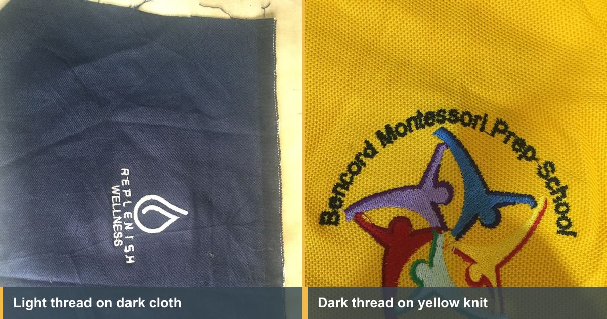
Look at the two jobs on this page. Light thread on dark cloth, and dark thread on a yellow knit.
Light on dark is the harder of the two. Anything the top stitches don't quite cover comes back as the dark garment underneath, so coverage has to be genuinely solid rather than nearly solid. That usually means more underneath it, not tighter stitching on top.
Strong colors behave the same way. A bright yellow will find any gap in a dark thread and show through it, which is why a design that looks fine on white can look thin on a strong color. Our post on why an embroidery design went wrong has a real example of exactly that.
The important part, and the part clients find surprising: the fabric decides how much design you can have.
A logo with a 10mm strapline will hold on denim and disappear on fleece. A fine outline reads beautifully on canvas and vanishes into toweling. So the honest sequence is to pick the garment, then decide the design, rather than approving artwork and hoping.
Where a client wants the same logo across several garment types, expect to simplify for the difficult ones. That's a conversation to have early, and it's covered properly in digitizing a logo for embroidery.
Worth saying plainly, because digitizing gets blamed for a lot of stabilizer problems.
Cut-away supports stretchy fabric permanently and stays in the garment. Tear-away suits stable wovens and comes away cleanly. Water-soluble topping sits on top of pile so the stitches don't sink. Choosing the wrong one produces faults that look exactly like density or underlay errors, and no amount of re-digitizing will fix a knit that was backed with tear-away. Our guide to embroidery stabilizers goes through all three properly.
Nobody gets this from a chart. The reliable method is boring and it works.
Take the fabric you actually use, stitch one design, change one thing, stitch it again. Write down what you did. Density, underlay, stabilizer, needle, and whether it came out right. Four lines per test.
After a couple of months you'll have a record built from your machine, your thread and the garments your clients actually buy, which beats any general advice including this article. It's the sort of thing worth keeping alongside the jobs themselves in EMBBA rather than on loose paper.
Everything above is one skill: predicting what a fabric will do before the needle touches it. That's the difference between someone who operates software and someone who digitizes, and it's why people who have run machines produce better files.
Our Digitizing Mastery course teaches that judgment alongside the software, including native wear, which almost nothing else covers. Most students are digitizing the basics inside a week. And if you'd rather buy designs already built by people who stitch, EmbGig is where to look.
Satin, almost always, because it gives a clean edge and a raised finish. Very large lettering moves to fill, since satin stitches that long will snag. Very small lettering is a size problem rather than a stitch type one.
Yes, and it's the setting that changes most between fabrics. Pile fabrics need the most, stable wovens the least. Leaving underlay on automatic is fine while learning and limiting once you're doing volume.
Because the t-shirt moves and the denim doesn't. Lower the density, check the pull compensation, and use a cut-away stabilizer rather than tear-away.
A sharp point suits woven fabrics like denim and canvas, and a ball point suits knits because it pushes between the loops rather than cutting them. Using a sharp on a knit is a quiet way to damage a garment that otherwise stitched perfectly well.
You can load it, and it will stitch something. It won't be right. Caps stitch outward from the center on a curve, so the sequence and the build both need to change.
Ask how much the fabric moves and how much it swallows. Movement means compensation and a cut-away stabilizer. Absorption means more underlay, a topping, and less fine detail. The stitch types stay the same everywhere. What changes is what you put underneath them and how much design the cloth can carry.
The Academy turns articles like this into proper courses, with video lessons, assessments, and people to learn alongside.