A logo was drawn for screens and print. Thread is a different material, and some of the design won't survive the crossing. Here's what changes and who decides.

Every logo you've ever been sent was designed for a screen or a printer. Both of those can put any color anywhere, at any size, with a soft edge if they feel like it.
Thread can't. Thread has a thickness, it comes in a fixed set of colors, and it has to sit on fabric that moves. So digitizing a logo isn't copying it. It's translating it, and translation always involves decisions about what to keep.
Here's what changes, what doesn't survive, and who should be deciding.
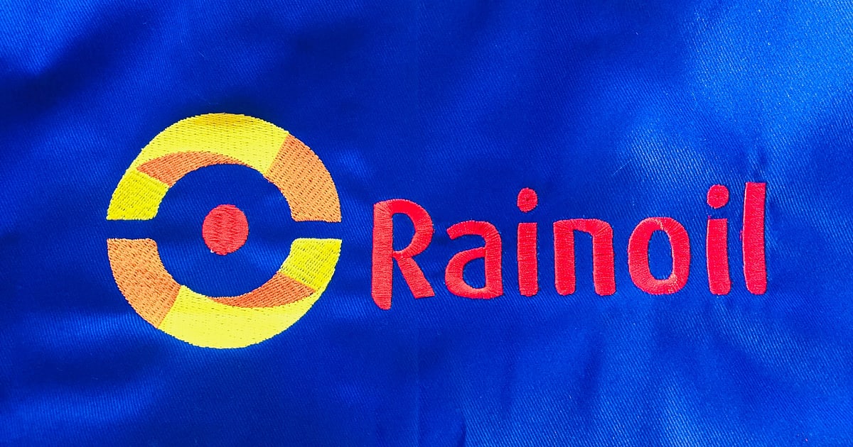
Look at the cover image. Solid blocks of color with clean boundaries, a bold letterform with enough weight to hold a satin stitch, and nothing that needed to be a gradient or a shadow.
That's not luck. It's a logo whose design happens to suit thread: strong shapes, high contrast against the garment, and lettering thick enough to survive at chest size. When artwork arrives like that, digitizing a logo is mostly craft rather than compromise.
Plenty of logos arrive in the opposite condition, and that's where the conversation has to happen.
None of this is the digitizer being difficult. It's the material. Our post on why an embroidery design went wrong shows what happens when these limits get ignored and the file is built anyway.
This surprises people with brand guidelines in hand.
Thread comes in fixed ranges. You pick the nearest shade from a chart, and the nearest is usually very close but rarely exact. A brand color specified as a precise print reference becomes "this thread, which is the closest we have", and on top of that the same thread reads differently on a light garment than a dark one because of what shows through underneath.
The practical answer is to stop approving colors on a screen. Get the thread numbers agreed, and where it really matters, stitch a sample and let the client hold it. A color signed off on a monitor is a color nobody has actually seen.
How many colors the design should use is a separate decision, and it costs machine time rather than accuracy. That's covered in how many thread colors a design should use.
This is the one that costs people money, because it sounds like it should be a resize.
A left chest logo is commonly around 90 to 100mm wide. A cap front is constrained in height and stitches on a curved surface from the center outward. A jacket back might be 250mm or more. Those aren't the same job scaled: the small one may need detail removed to survive, the large one needs density reconsidered so it doesn't become heavy, and the cap version is a different build entirely.
Scaling a finished stitch file doesn't solve it either, because the stitch count stays the same while the area changes. Bigger goes thin and gappy, smaller goes dense and stiff. The reason why is in our guide to embroidery file formats.
So budget for a version per placement, and get them made together while the design is fresh in someone's mind.
Placement is worth agreeing at the same time, because it decides the size. Left chest sits roughly a hand's width from the center seam, level with the underarm. Cap fronts are limited by how much height the frame gives you before the seam gets in the way. Sleeves are narrow, so a logo usually has to become a badge or a line of text. Backs can take almost anything, and mostly the limit is what the client wants to pay for in stitches.
The hardest part of digitizing a logo is often telling a client that something has to change. It helps to be clear about why.
The goal isn't a perfect replica at any cost. It's a piece the client is proud to wear. A logo reproduced faithfully, including the hairline and the 6mm strapline, and stitched at chest size, will look worse than one where two elements were sensibly simplified. Fidelity to the file and fidelity to the brand aren't the same thing.
Three rules that keep this civil:
Most of the arguments in this trade come from one of those six being assumed rather than agreed. There's a fuller checklist in our guide to hiring an embroidery digitizer.
Worth a line, because it catches people. Being handed a logo isn't the same as being allowed to reproduce it. If someone brings you a brand they don't own, that's their problem legally but it becomes your problem practically, because you're the one who stitched eighty of them.
For ordinary corporate work this is a non-issue: the client owns the mark and wants it on their staff shirts. For anything else, a short message confirming they have the right to use it is cheap insurance.
Once you've done a few of these, the admin becomes the problem. Which file went to which client, in which format, with which thread numbers, at which size, and which version they approved.
A year later that client wants caps, and the difference between a same-week turnaround and starting the whole job again is simply whether any of it can still be found. EMBBA keeps orders, clients and files together for exactly that reason.
Logo work is the bread and butter of most embroidery businesses, and it's the skill that pays for itself fastest, because corporate clients reorder.
It's also learnable. The judgment involved is knowing what thread will do to a shape before you commit, which comes from stitching things out and looking hard at what came back. Our Digitizing Mastery course teaches that machine-side reasoning alongside the software, and most students are digitizing the basics inside a week.
Almost any logo can be interpreted in thread. Not every logo can be reproduced exactly, and the difference matters most with gradients, fine detail and very small text.
It depends on the detail inside it rather than the logo itself. As a rule, if there's lettering, the lettering decides. Keep it above about 12mm and work back from there.
Close, rarely exact. Thread comes in fixed ranges, so you pick the nearest shade and approve it on fabric rather than on a screen.
Yes. A cap design stitches outward from the center on a curved surface, and a flat version resized will not behave. Treat it as its own job.
Because the garment underneath affects everything above it. Light thread on dark fabric needs more underneath it to stop the color reading through, which is a build decision, not a thread problem.
Digitizing a logo is translation, not duplication. Gradients, shadows, hairlines and tiny text don't cross over, thread colors land close rather than exact, and every placement is its own file. Agree what changes before the work starts and the job goes smoothly. Leave it to be discovered on the garment and it won't.
The Academy turns articles like this into proper courses, with video lessons, assessments, and people to learn alongside.