
Two real badges that came out badly, read closely. What went wrong in each, which part of the job caused it, and how to stop it happening on the next run.

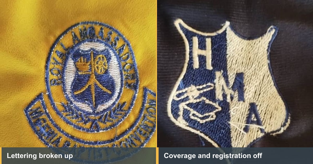
You've got a piece in your hand and it's not right. The lettering has closed up, or the fabric shows through, or something has shifted. The client is expecting eighty of these on Friday.
Most articles on this answer with a list of causes. This one does something more useful: it looks at two real badges where the embroidery design went wrong, and works backwards from what you can actually see.
Before anything else, decide which part of the job failed. Almost everything falls into file, machine or setup.
The quickest test is repetition. Run it again on scrap. If the fault lands in exactly the same place both times, it's the file. If it moves around, or the design used to run cleanly and now doesn't, look at the machine and the hooping first. A bent needle and a shifted hook assembly both announce themselves this way, and neither puts anything on the screen to warn you.
That distinction saves people from re-digitizing a design that was never wrong. Our guide to the seven common digitizing mistakes has the full symptom-to-cause list.
Check the hooping while you're there, because it's free and it causes more faults than it gets blamed for. The garment should be firm in the frame without being stretched. Stretched fabric springs back after the design comes out and takes the stitches with it, which looks exactly like a density problem and isn't.
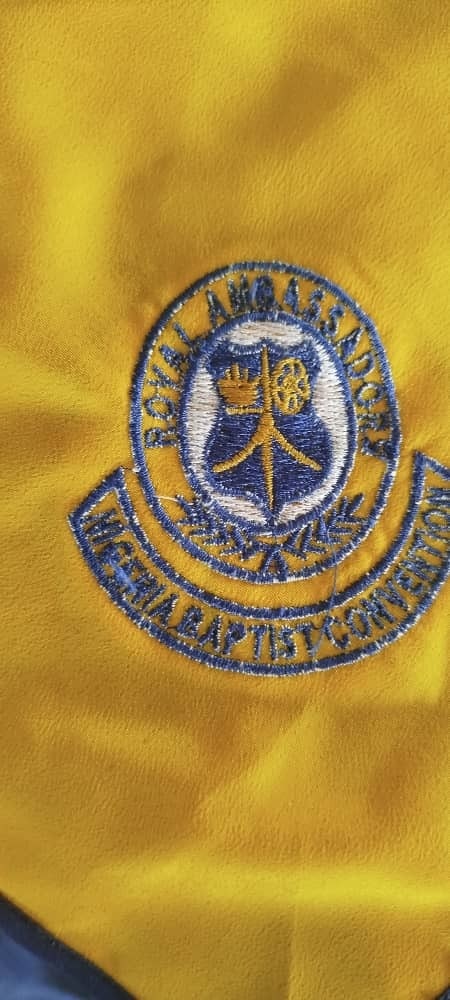
Look at the curved text around the top and bottom. The letters are thin, they've lost their shape, and the yellow garment is showing straight through the blue. At a glance it reads as embroidery. Up close it's barely readable, and on a badge whose whole purpose is the name, that's a failed job.
What caused it. Almost certainly the letters were too small for what was asked of them, then made worse by two things. The stitching has no room to build a proper edge, so each letter comes out as a thin line rather than a solid stroke. And on a strong color like this yellow, any gap in coverage is obvious, because there's a bright background fighting through from underneath.
What would have prevented it. Keeping lettering above about 12mm, which is the working rule. Below that every decision has to be right at once, and a curved baseline makes it harder still because the letters have to hold their width around the arc. Where a client insists on smaller text, the honest answer is to redraw it bolder or drop a word, not to shrink what's there.
There's also a color lesson. Dark thread on a bright garment shows every fault. The same file on a white or pale garment would have looked considerably better, which is exactly why a stitch-out has to happen on the fabric you're actually using.
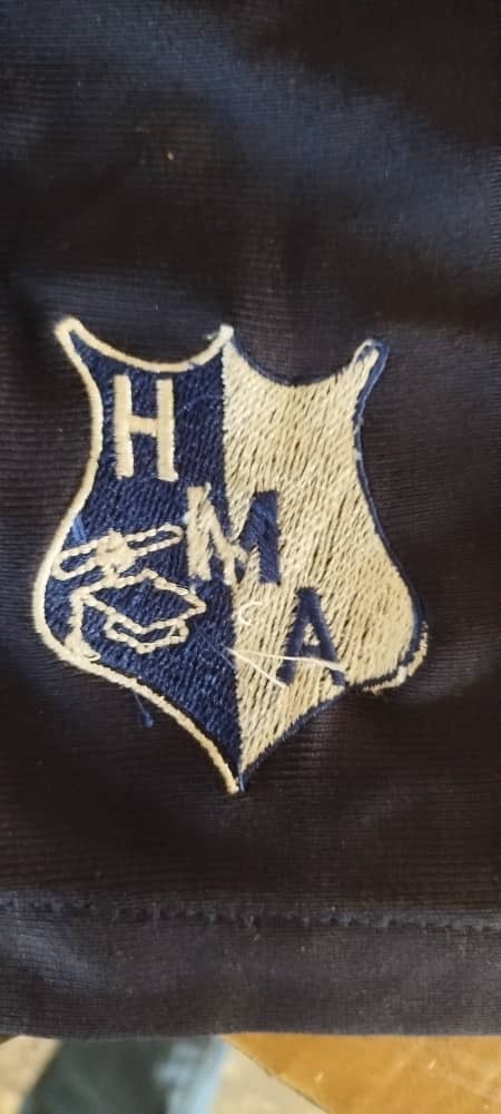
Different failure, same feeling. The cream areas are thin enough that the navy garment reads through them. The element in the lower left has lost its shape entirely. There are loose thread ends lying across the face of the badge, and along parts of the border the outline and the fill aren't meeting.
What caused it. Three separate problems that arrived together, which is normal.
The thin coverage is a density and underlay problem. Light thread over a dark garment needs more underneath it than most people expect, because anything the top stitches don't cover comes back as dark. The shape that's collapsed is small detail that needed rebuilding rather than reducing. And the border not sitting on the edge of the fill is pull compensation, or the lack of it: the stitches drew the fabric inward as they formed and nothing accounted for the movement.
The loose threads are a different matter entirely. That's finishing, not digitizing. Trims left uncut are a two-minute job at the table and they make good work look careless.
What would have prevented it. A stitch-out on the same navy fabric. Every one of those faults is visible immediately on a test piece and invisible on a screen.
Take whatever went wrong and check these in order. It's quicker than guessing.
Sometimes, and it's worth knowing before you write off a garment.
Loose threads and stray trims just need finishing properly. Thin coverage can occasionally be improved by running the design a second time in perfect registration, though that's a gamble and it stiffens the result. Puckering will sometimes relax with a press and a damp cloth if the fabric hasn't been permanently drawn in.
What can't be rescued is collapsed lettering. Once the letters have closed up there's nowhere for the thread to go, and stitching over the top makes it worse. That one is a remake, which is why small text deserves a test run of its own.
One habit fixes most of this: stitch one before you stitch eighty, on the actual fabric, with the actual stabilizer and the actual thread.
People skip it because it costs a piece of scrap and ten minutes. Then a failure like either of the two above arrives on garment one of a client order, with a deadline attached, and the test that would have caught it looks very cheap in hindsight.
The second habit is writing down what worked. Fabric, stabilizer, density, underlay, and whether it came out right. Four lines per job. After a few months you stop solving the same problem twice, and it's the sort of record EMBBA is built to keep alongside the orders themselves.
If you paid someone for the file and it produced either of the results above, that's a fault in the digitizing and fixing it is their job, not a new charge. Changing your mind about the design is different and fair to charge for. Agreeing which is which before work starts avoids the argument entirely, which is one of the questions in our guide to hiring an embroidery digitizer.
Worth knowing too that files sold for very little are usually traced by software with none of these decisions made, which is the subject of hand digitizing vs auto digitizing.
Everything above is a judgment about how thread behaves on a particular cloth, and those judgments are learnable. Once you can look at a bad stitch-out and name the cause, you stop being at the mercy of whoever made the file.
That's what our Digitizing Mastery course teaches, the machine-side reasoning rather than which button to press. Most students are digitizing the basics inside a week and building from there. And for designs that aren't a client's own logo, EmbGig files are made by digitizers who actually stitch, which removes the gamble.
Because the preview draws the file's intentions on a surface that never moves. Puckering, thread breaks and collapsed lettering all happen in the cloth, and none of them exist in the file for the software to show. There's more on that in how to spot good embroidery digitizing.
Run it again. Same fault in the same place means the file. A fault that moves, or a design that used to run cleanly, means the machine or the hooping. Change the needle before you change anything else, it costs nothing.
Rarely. If the letters have closed up, the design needs rebuilding at a workable size. Stitching over the top adds thread to a place that already has too much.
Underlay, usually, and it's worst with light thread on a dark garment or any thread on a strong color. The layer underneath is what stops the fabric reading through.
When an embroidery design went wrong, work backwards from the piece rather than guessing. Run it again to tell the file from the machine, check the small text, the joins and the back, and remember that almost every fault in both badges above would have been obvious on a single test stitch-out.
The Academy turns articles like this into proper courses, with video lessons, assessments, and people to learn alongside.