
Seven digitizing mistakes that waste thread and fabric, what each one looks like when it stitches, and how to tell a bad file from a machine fault.

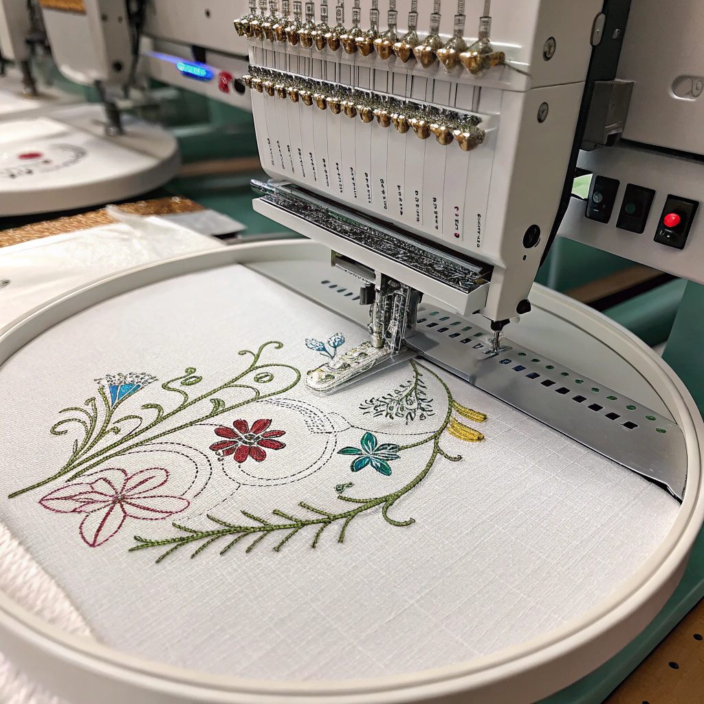
Embroidery digitizing turns a design into a stitch file a machine can read. It's a good skill to have and a satisfying one, but it's unforgiving. A file that looks perfect on screen can still ripple the fabric, swallow your lettering, or break thread every two minutes on the machine.
Here are the seven embroidery digitizing mistakes that cause most of it, what each one looks like when it stitches, and how to fix them. There's also the thing nobody mentions, which is that sometimes the file is fine and your machine is the problem.
Start here, because it saves you from re-digitizing a design that was never wrong.
I've fixed plenty of machine faults over the years, and two of them stand out because of how they announced themselves. Not with an error on the screen. Not with any warning at all. Just a design that suddenly stopped running properly.
The first was a shifted hook assembly. The job went wrong, the stitching came out badly, and every instinct said the file was at fault. It wasn't. The second, and far more common one, was a bent needle. Same story. The design ran badly, nothing on the machine said why, and the fix cost almost nothing once I knew where to look.
So before you open the software: look at the needle, check your tension, check the hooping. If the same file used to run cleanly and now doesn't, the file didn't change. Something on the machine did.
With that out of the way, here are the seven that really are digitizing.
What goes wrong: choosing the wrong stitch type, whether fill, satin or run, leads to poor coverage, puckering, or designs that don't look right. A fill stitch on thin lines, or a satin stitch on wide areas, often causes thread breaks or uneven stitching.
What it looks like: satin columns wider than about 10mm start to snag and sag, because there's nothing holding those long stitches down. Fill on a thin line comes out ragged and stiff.
How to fix it: understand what each stitch is for. Fill stitches work well on larger areas. Satin stitches are great for text and narrow shapes. Run stitches suit outlines and fine detail. Then test stitch combinations on scrap fabric to see what works for your project and material.
What goes wrong: too much density causes stiffness and thread breaks. Too little lets the fabric show through. Both give poor results.
What it looks like: too dense and the design feels like a piece of cardboard, sits proud of the fabric, and cracks along the fold after a few washes. Too light and you see the garment through the stitching, worst on dark thread over light fabric.
How to fix it: aim for a balanced density. Around 0.4mm to 0.5mm is a good starting point. Adjust from there based on your fabric and thread, and test how the stitches behave on your material.
What goes wrong: a poor stitch sequence leads to unnecessary jumps, trims and misalignment. The design looks messy and takes longer to run.
What it looks like: the machine trimming constantly, and a run time far longer than the stitch count suggests. On a production floor this is money, not tidiness. A badly pathed logo can take half again as long as a well pathed one with the same number of stitches.
How to fix it: plan your pathing. Start from the center and work outward, stitch bottom to top, and group similar colors and elements together. Use your software's pathing tools to visualize and tidy the sequence.
What goes wrong: too many small details or colors overwhelm a design. Small elements get lost and the final piece looks cluttered.
What it looks like: detail that reads beautifully on the screen and turns to mush at 60mm wide. Thread has a thickness. Below a certain size the machine physically cannot put the detail there, no matter how good the file is.
How to fix it: simplify. Keep it clear, especially at smaller sizes. Focus on bold shapes and fewer color changes. Redraw fine detail as a bolder shape rather than shrinking it. A simple, well-executed design always stitches better than an overly detailed one.
What goes wrong: skipping test runs means errors only show up in final production, which wastes materials and causes frustration.
What it looks like: finding out on garment number one of eighty, with the deadline already tight. The test costs one piece of scrap and ten minutes. The alternative costs the order.
How to fix it: always test. Use similar fabric with the same stabilizer and hoop, then check coverage, puckering and alignment before you run the full job.
What goes wrong: without underlay, the top stitches sink into the fabric. You get uneven texture, gaps and weak structure.
What it looks like: stitches disappearing into a towel or a fleece, and lettering that looks thin and starved even though the density is right. Underlay is the foundation the design sits on, and skipping it shows most on anything with a pile.
How to fix it: use the right underlay for your design and fabric. For fill stitches, use a crisscross or grid underlay. For satin, use a center or edge run. Don't rely only on automatic settings, adjust manually when needed.
What goes wrong: different fabrics behave differently. A design meant for canvas may pucker on stretchy knit or get lost on plush fabric.
What it looks like: the same file running perfectly on a polo and puckering on a cap. This is the mistake that separates people who digitize from people who run machines, and it's the one that costs the most, because the file isn't obviously wrong. It's just wrong for that garment.
How to fix it: identify the fabric first, then adjust density, underlay and pull compensation to match. Always test on the same fabric you'll use for the final product. Our guide to stitch types for different fabrics goes through this cloth by cloth.
Most people don't arrive with a mistake in mind. They arrive with a bad stitch-out on the table. Here's how to read it:
Roughly speaking: faults that appear in the same place every single time are the file. Faults that come and go, or that started happening to a design that used to run fine, are the machine.
For two real badges read this way, fault by fault, see why your embroidery design went wrong.
Every mistake above can be bought as well as made. Auto-digitized files sold for a couple of dollars carry most of them at once, which is covered in more detail in our guide to what embroidery digitizing costs and in what to look for when hiring a digitizer.
If you'd rather not gamble, EmbGig is a marketplace of machine-ready designs from digitizers who do this every day, with instant download and commercial use included. For anything that isn't a client's own logo, that's usually the shorter route.
Density, closely followed by ignoring the fabric. Both come from the same habit: treating a design as artwork rather than as instructions for a needle going through cloth.
Run the same file again. If the fault lands in exactly the same spot, it's the file. If it moves around, or if the design used to run cleanly, look at the needle, the tension and the hooping first.
No. Auto-digitizing makes most of them at once, because software doesn't know what fabric you're stitching on or how small your text is. We went into this properly in can AI replace embroidery digitizers.
As a working rule, keep lettering above about 12mm tall, and go bigger on anything with a pile like fleece or toweling. You can go smaller, but it takes a very clean file and the right stitch choices, and it's exactly where cheap digitizing falls apart.
Digitizing is part art, part science. Learn from these common embroidery digitizing mistakes, apply the fixes, and the quality of your work climbs over time. Keep practicing, keep testing, and check the machine before you blame the file.
Want a structured path? Our Digitizing Mastery course takes you from the basics to clean, professional designs, including the machine-side judgment that stops most of these mistakes before they reach fabric.
The Academy turns articles like this into proper courses, with video lessons, assessments, and people to learn alongside.